01 Overview
About the project
Agent Complex Flight Change
An intuitive streamlined chat experience for agents
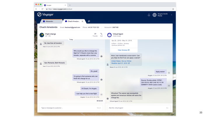
When customers reach our agents to do a flight change, agents need to open up to 10 tools to complete a single task depending on how complex the flight change task is. In this project, I helped create a rich chat-based streamline experience for agents to solve complex flight change problems using only one tool.
The product fully launched in Dec 2019
Background and Goal
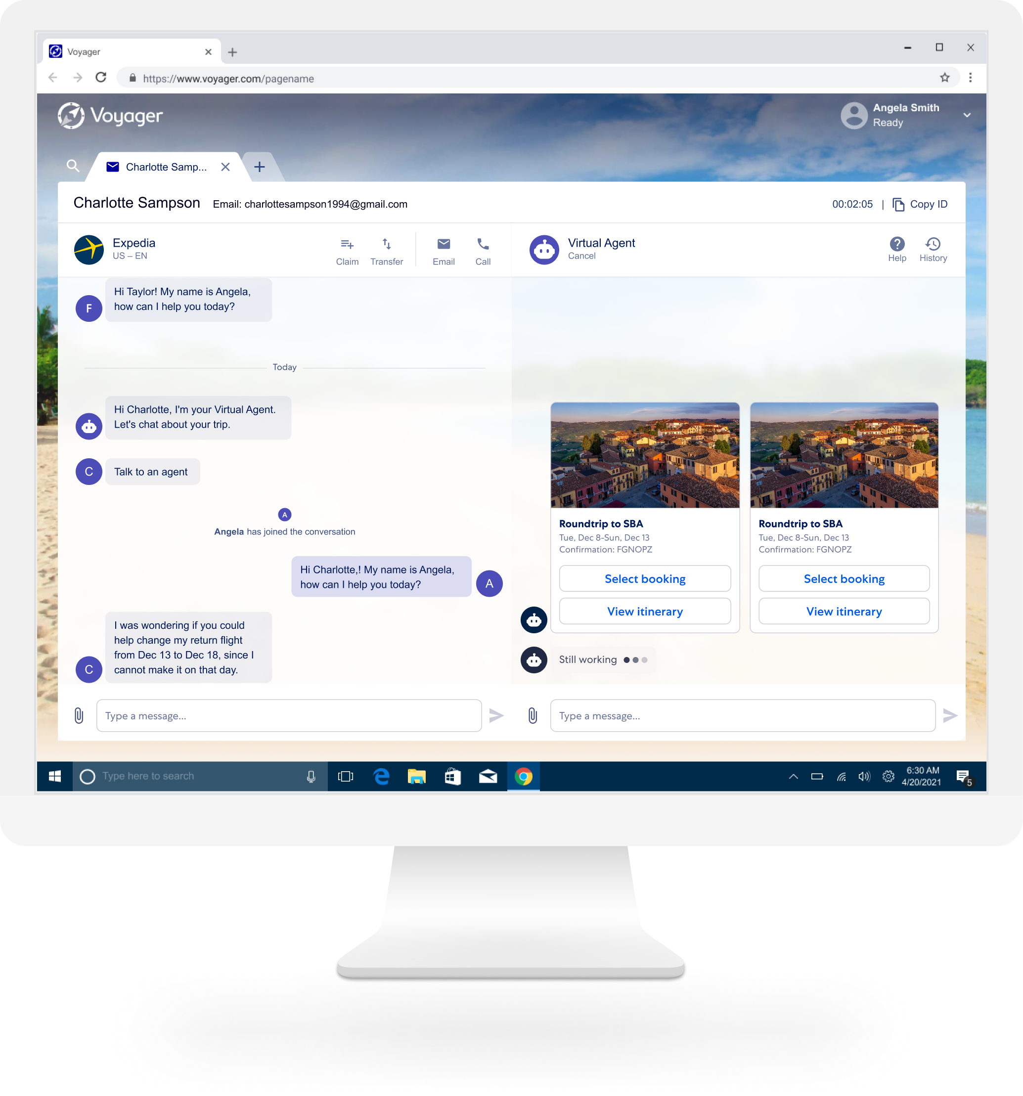
In 2019, I led the design of flight exchange virtual agent chatbot experience for travelers. We got a very good response after the product was released in the virtual agent platform, and this product has increased our self-service adoption rate by having additional and more intuitive entry points, expanding to other POSs more rapidly. Based on this, I was asked to build a streamlined version of flight exchange experience on our brand new agent CRM tool, Voyager Next, utilizing the same traveler-related skills but configured to work for agents. This could help agents complete tasks quicker and eliminate costly errors.
My role
This is an extremely complex project, and it’s also the first chat experience with multiple robust card interactions that are built in our new agent tool.
As the design lead, I collaborated closely with product managers, content strategists, business intelligence, technical project managers, engineers, service delivery folks, brand strategists, learning and development folks, fulfillment team, agent training team, and air experts to help define and dream about the best future agent chat-based user experience.
Main delivery
- storyboards
- user journey map
- flight exchange agent task flow
- system logic workflow
- high-level flight exchange UX flow
- conversation UX workflow
- wireframes
- interaction models to multiple robust cards
- chat user experience flow
- mocks for North Star and Phase 1
- prototypes of multiple concepts
- redline
UX Activities
- Conducted multiple workshops with flight experts and stakeholders.
- Conducted the focus groups, side-by-side observation, interviews, and surveys with the real agents from the call center.
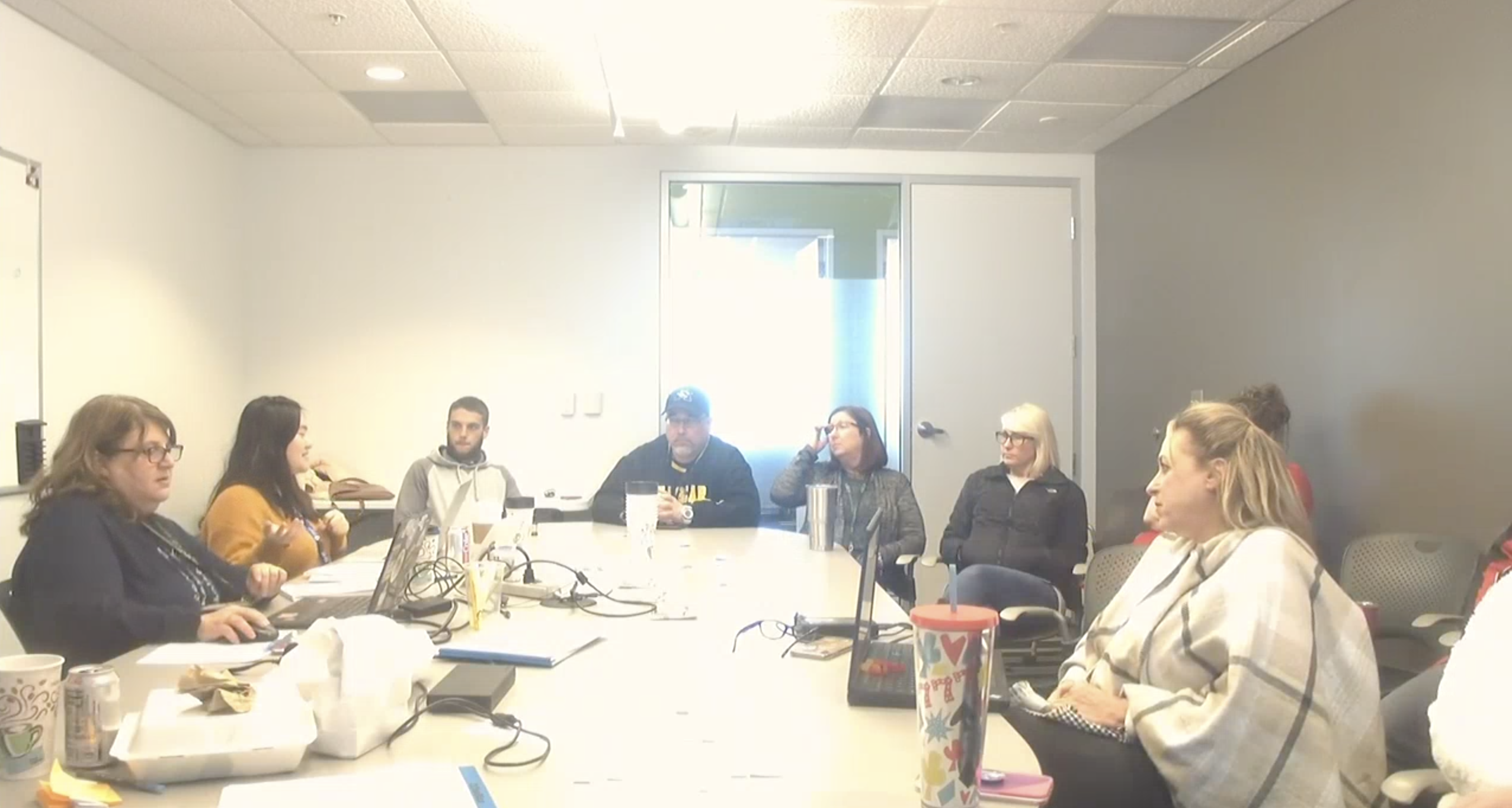
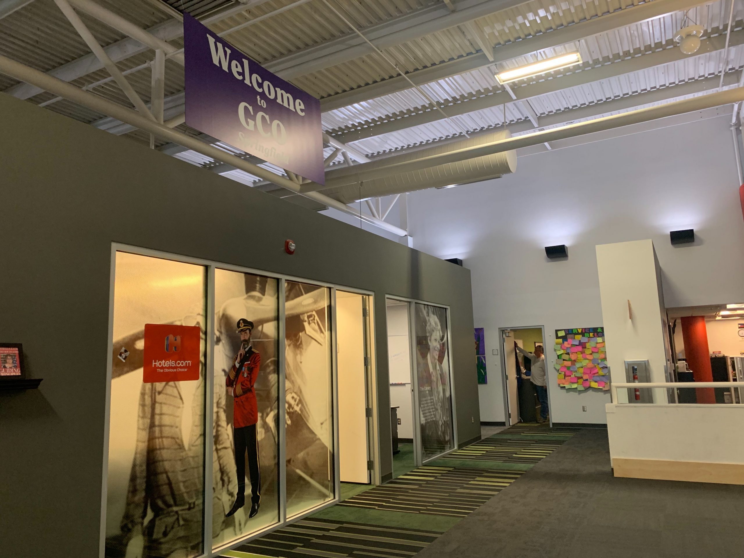
- Conducted user research and usability testing in person in Springfield, Missouri with Tier 3 Call agents, and remotely with EL Salvador T1 Call and Chat agents.
- Worked with an instructional designer at the end to deliver videos for call center agent training.
02 Impact
The final results
The Impact:
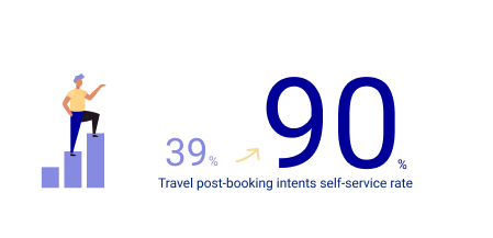
- Designs contributed to meeting the goal to increase self-service capability from 39% to 90% of travel post-booking intents.
- Designs contributed to meeting the organization’s goal to achieve and maintain platform availability of 99.99% or better.
- Designs contributed to the requirement in order to retire the Voyager Flights agent tool
- Increased agent engagement resulting in reduced operational costs.
- Agent and stakeholder feedback has been positive.
Value add for Expedia Group Platform:
Air Exchange is one of the top call drivers for any brand/partner that sells Air, by having self-service flight change as part of the Expedia Group Platform, each brand/partner can save operational costs
03 The Process
How I got there
As we all know, Human-Centered Design (HCD) is a problem-solving framework that is grounded in empathy and understanding. I am a big fan of it because I believe it could help make systems and products more responsive to the people, or the customers, who use them.
During my design period, I tried to apply HCD methodology as much as I can, even with a tight deadline, by conducting rigorous qualitative research to deeply understand the needs, insights, and emotions of my audience.
The Design Process
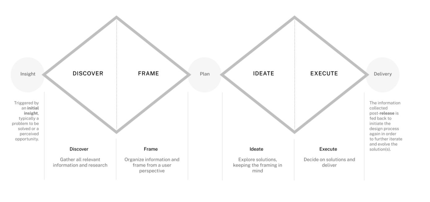
The overall design process I used could be summarized as the Double Diamond above. The process is cyclical. People and their needs are dynamic and changing and so our solutions are dynamic and changing. During the design process, once a design solution is launched, I measure its effectiveness against initial and intended aims, and then I continually tweak it, thus improving the solution over time.
04 Digging into the project
Discover, Frame, Ideate, Execute
I. Discover
Understanding agent types, behaviors, and working process
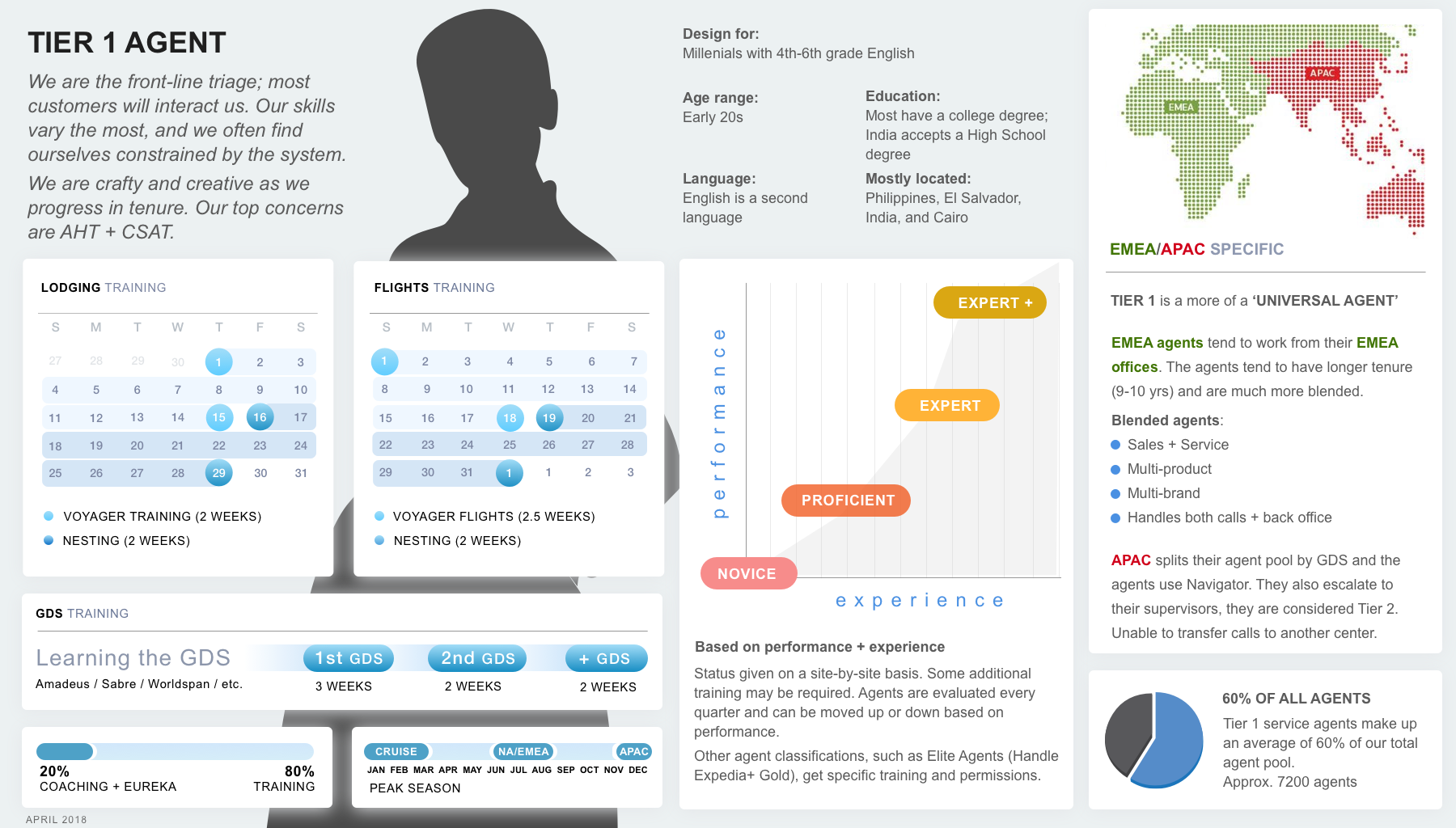
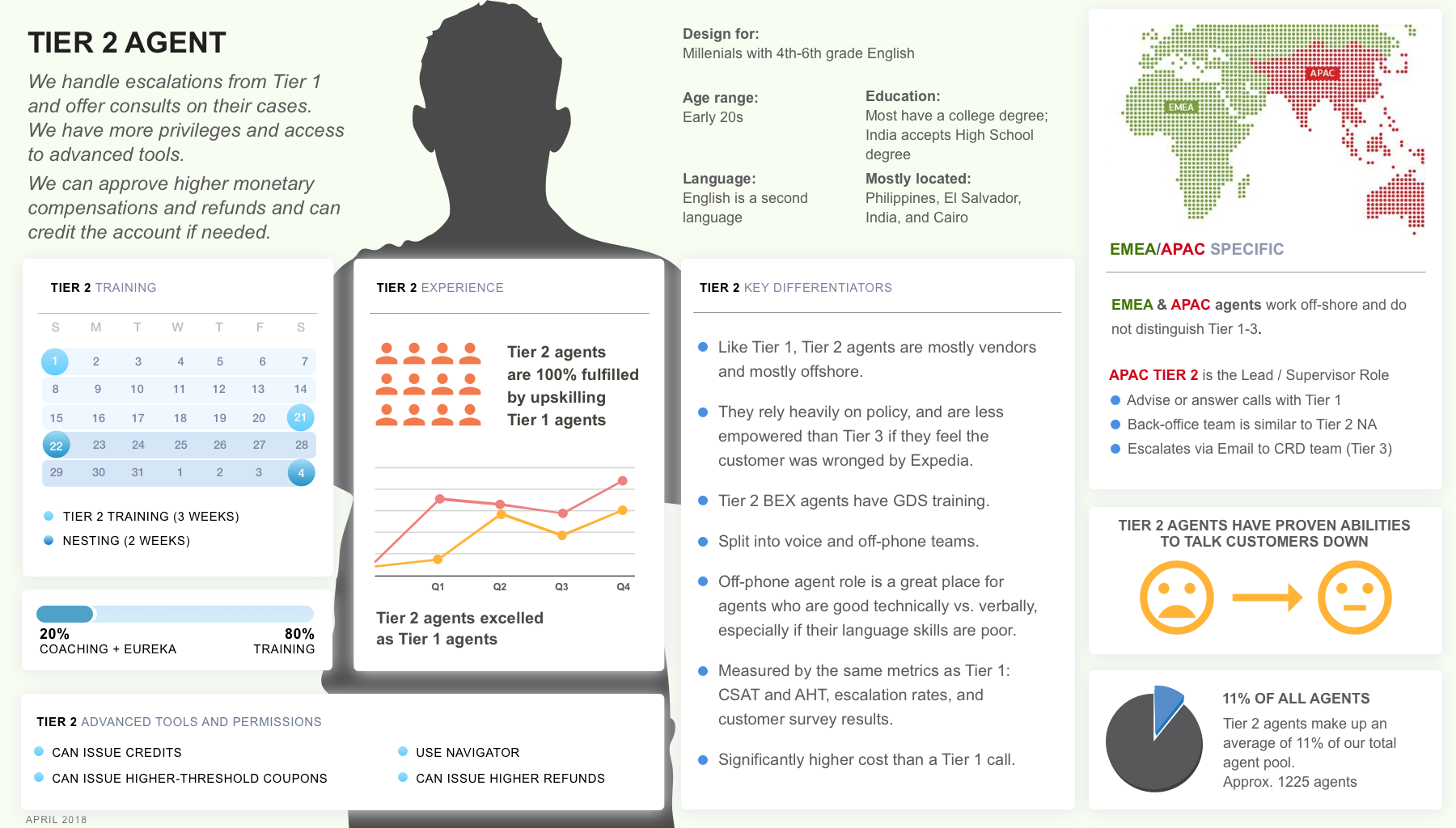
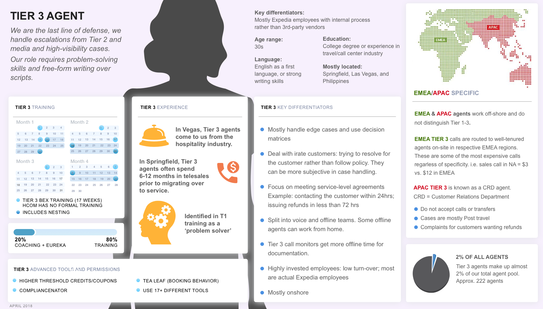
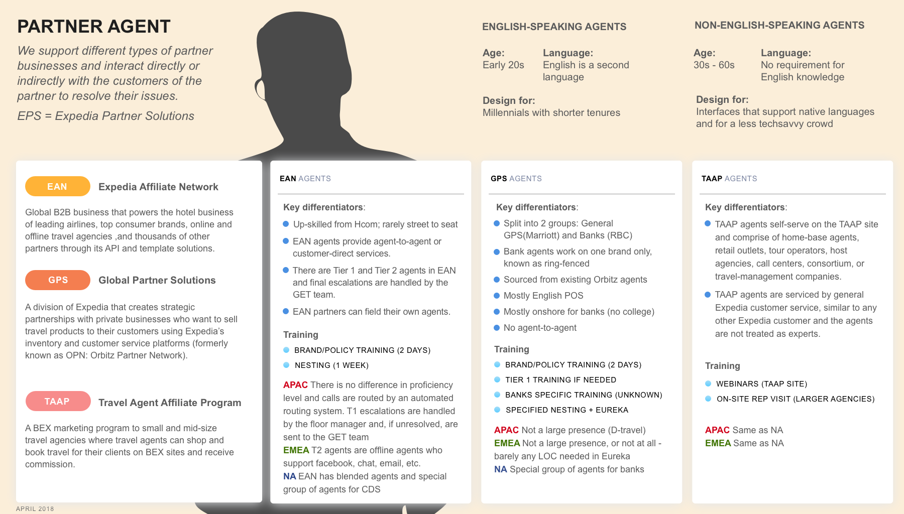
Who am I designing for and what are their behaviors are the main questions I ask before kicking off any of the designs. In this case, my audience for design is the Expedia global contact center agents. Based on the discovery I found that there were a lot of complexities that needed to be considered when designing for our agents such as agent tier, experience, and location.
At Expedia, we have
and they
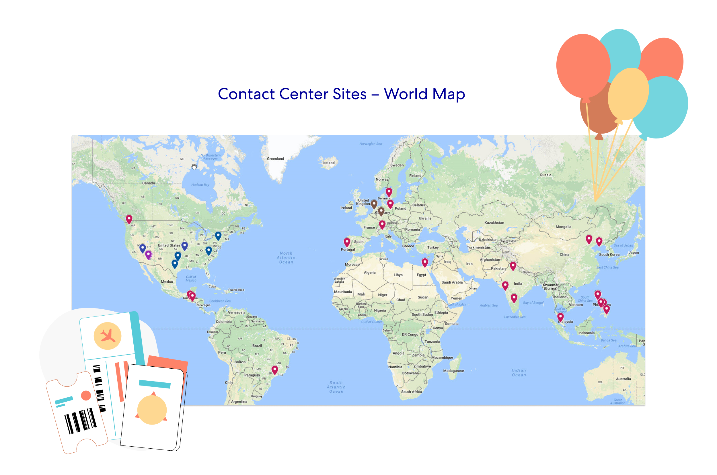
Our agents have three Tires (T1, T2, and T3), and each tire of agents has unique responsibilities, experience, and training processes.
Image: agent profiles
What’s the current flight change experience for agents?
After I have learned more about agents’ profiles, more questions came to my mind:
- What tools do they use?
- What is the current process for agents to complicate a flight change task?
- How long does the entire process take?
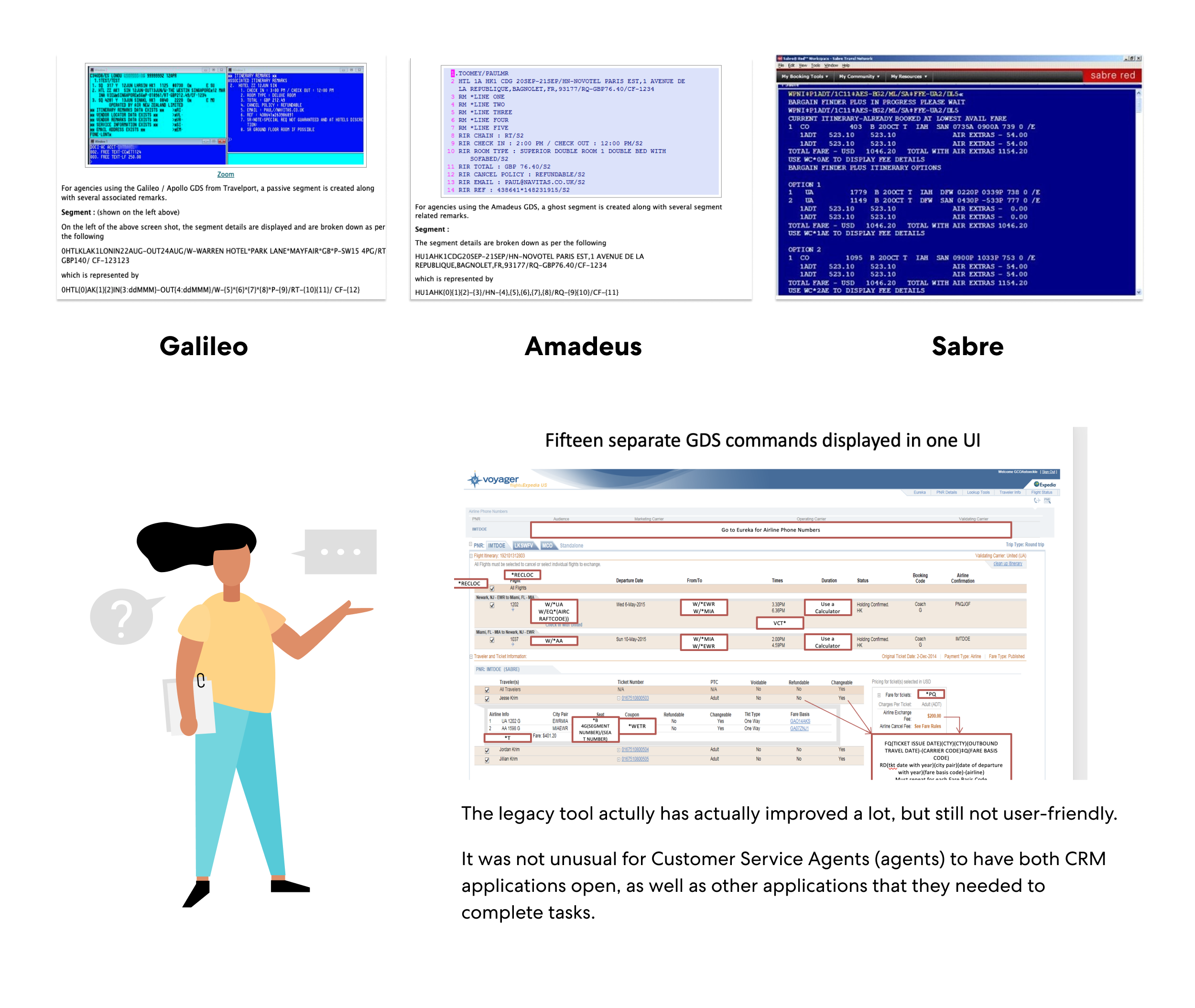
As a designer, the quickest way for me to figure out the above questions is to ask for screenshots/demos of the current flight change design, since I would like to ensure my future design is harmonious with agents’ current existing experience. It pays to know what’s worked and what hasn’t, especially our goal here is to envision a brand new agent experience using AI technology.
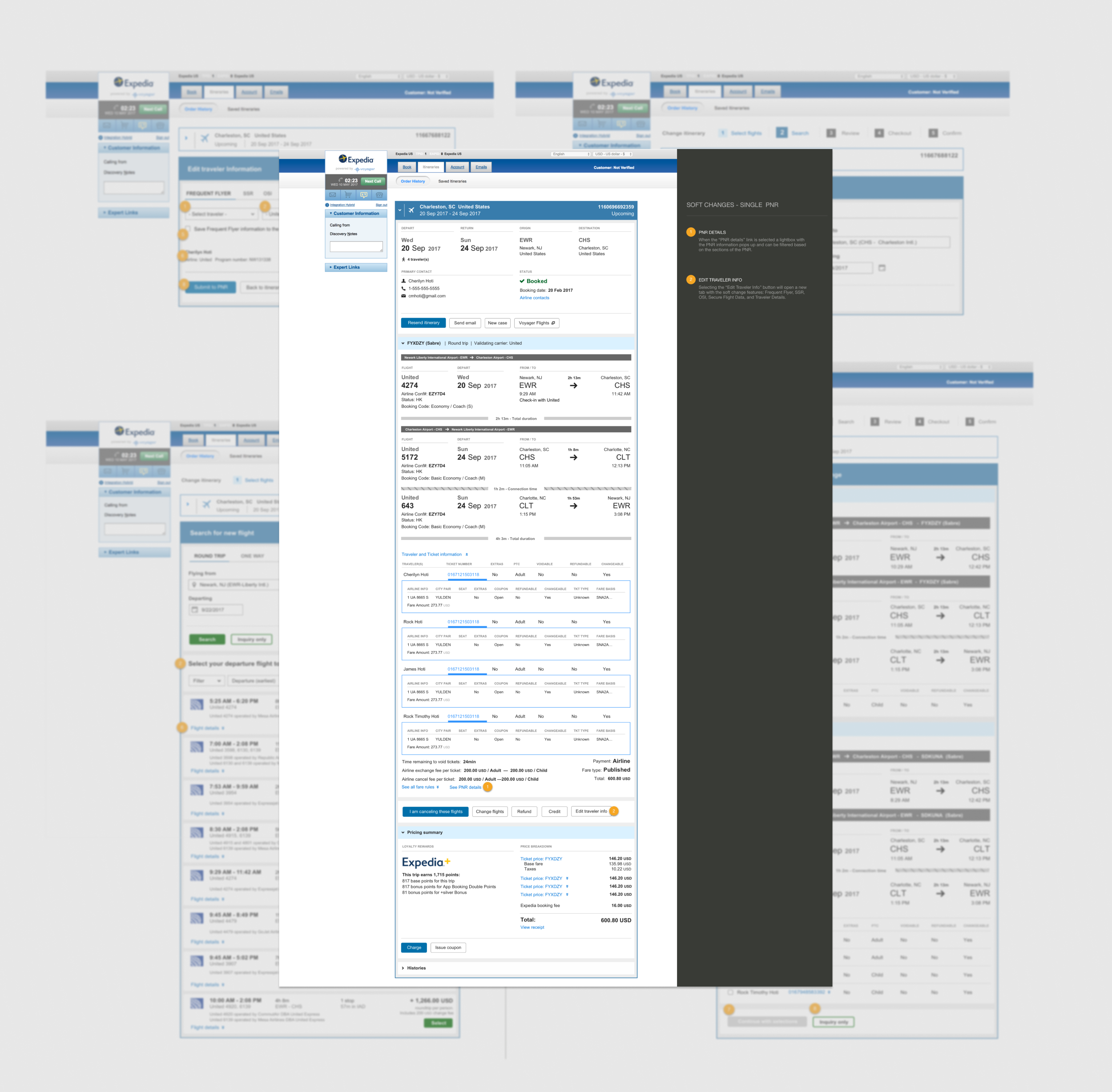
Image: screenshots of legacy flight change design
II. Frame
User Research
Understand agents’ needs and pain points
I conducted multiple workshops with flight experts and stakeholders to understand the agents’ needs and pain points for the current flight change process. This helped me understand more about the complex flight scenarios, and was also very helpful with identifying the use cases.
Learning from experts, and stakeholders
Image: experts list (blurring names and faces for privacy)
Ask and get inspired
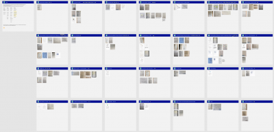
Image: Explore and capture ideas
Note any How Might We’s
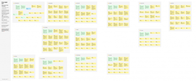
Image: How Might We’s
User Mapping to collect use cases

Image: User Mapping
Besides, I also conducted several rounds of focus groups, interviews, and observation sessions with real agents. These UX activities helped me gain a lot of qualitative data including agents’ pain points, thoughts, and real needs. I also learned many flight policies, general flight domain knowledge, and I have realized how complex the process is for flight agents.
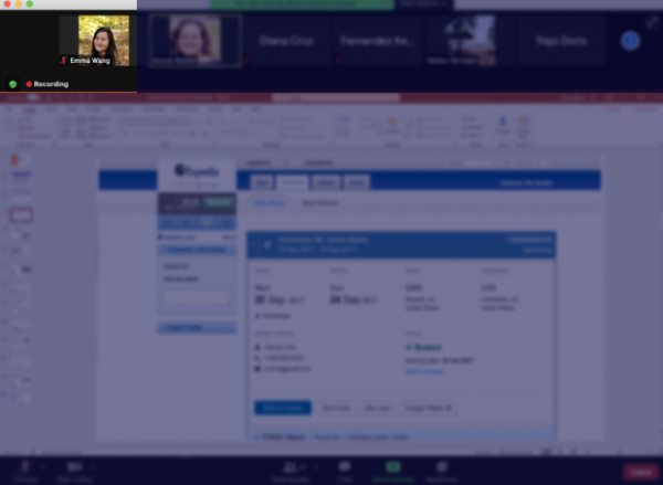
Image: focus group with T3 agents
After gathering mostly qualitative data, I put together a journey map to illustrate the actions, touchpoints, required tools, feelings for agents doing a flight exchange. This journey map was share-out with a wider team including product managers and content strategists to gain a better understanding and alignment of how the ideal future chat-based flight exchange process could be, and where we could build the eligibility check and logic points.
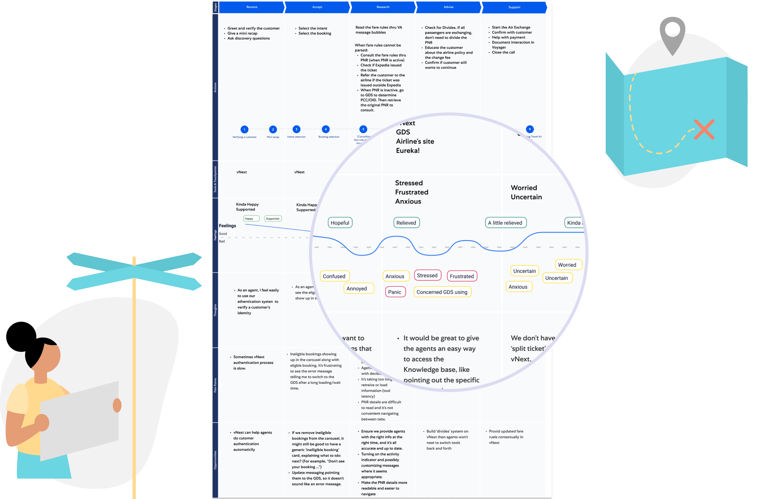
Image: agent journey map for flight change
Insights


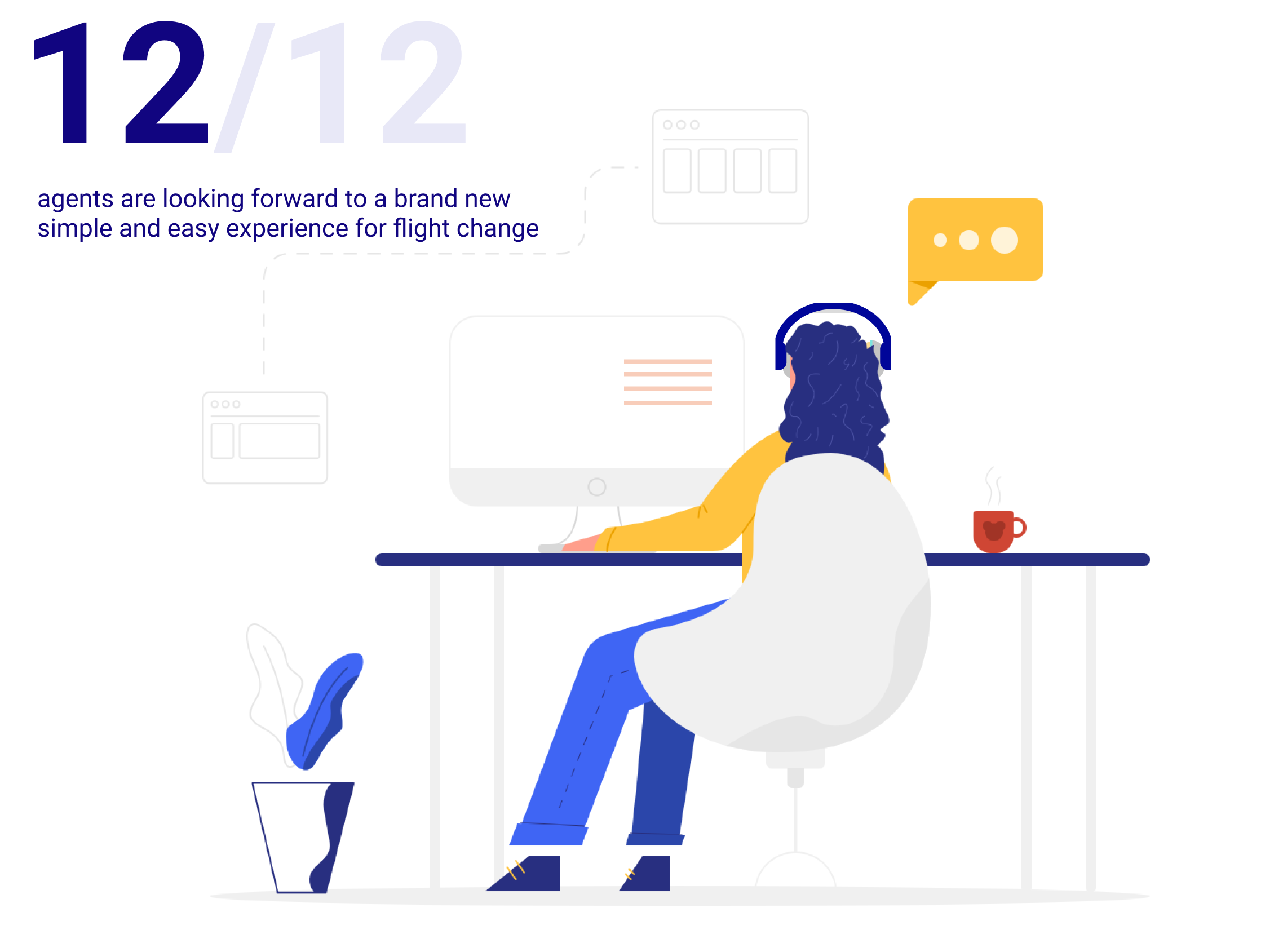
From the interviews and focus group sessions, I found out agents are using two screen monitors when working since they need to use up to 10 tools when doing the flight exchange task for a single person.
They also need to document the cases, file out a survey. The whole process is extremely time-consuming, some newly hired agents mentioned they sometimes feel hopeless when customers call to have a complex flight change, then they need to look for step by step guidance in the Eureka, sometimes they have to do the escalations.
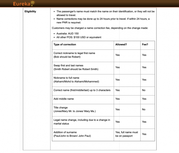
Image: Eureka, the knowledge base for agents
I was not too surprised, since the current CRM applications were developed in approximately 2000, and I know agents eager to have a brand new streamlined experience to make their life easier. According to the data from the data analysis team, Expedia needs this to be designed to increase agent engagement resulting in reduced operational costs, and it also meets our organization’s business goal to retire the old tool Voyager Flight. And that’s my mission.

Early Tech Sync
Determine tech challenges and limitations
I always believe it’s important to involve Devs in the early stages of the design circle. It not only helps them be aware of the reason behind the design actions but also helps me clear out the tech challenges and limitations. I conducted several work sessions with pm, tpm, and devs to understand the tech limitation from a tech perspective, also understand how it works and could be done in the back-end for the current and future agent tool.
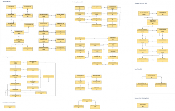
Image: Dev’s early proposed decision tree
Redefine
Redefining the problem space & measuring success
After rounds of discussions with Devs, my PM and I worked together to redefine the problem space, project scope, and align the required and nice to have features/cases. Later shared that with all the internal teams and stakeholders. Some examples here: we defined the fallback cases for when automation is not available. When this happens, what we could potentially show based on the user experience, agents’ intuitive best next actions, tech resources (architecture, API, etc.), and platform limitation (when GDS needed). We also redefined our scopes at this stage to set a clear expectation.
The new scopes:
Fully automated flight change:
In Scope
- GDS: Sabre, Amadeus, NDC
- Merchant Model: Merchant, Agency, FlexMoR, SubPub
- Booking type: Standalone, MICKO/package
- Flight type: One way, round trip, split ticket, multi-destination (with up to 2 O/D pairs)
- Changes allowed: Voluntary date change, time change, origin/destination change, upgrades/downgrades, airline credit redemption in vNext
- Trip stage: Pre-trip, enroute
- Original itin purchased via Any form of payment (including Points)
- Forms of payment allowed for change: Credit card
- Additional use cases:
- Itineraries originally with brand fares, paid seats, insurance
- Changes for less than all travelers
- MCO issuance when there’s the residual value after the exchange (US Only)
- Change fee charged on EMD when applicable
- Interline
- Code-share
- Domestic and international travel itineraries
- Ingress: All C3 Entry Points for customers and vNext for agents
- Notification Types: Change confirmation email
Out of Scope
- Involuntary changes
- Extenuating circumstances
- Partially automated changes
- Multi-destination with 3 or more O/D pairs
- Name changes
- Worldspan inventory
- Itineraries with infants
- Payment types other than credit card (i.e. coupons, points, etc.)
- Consolidator fares
- LCC, Ticketless, Charter, Basic Economy fares
- MCO redemption through self-service
- Out of Sync
- Changes with waivers
- Changes within the void window
- Not Ticketed
- Flight Starts in next 6 hours
Partially automated flight change:
In Scope
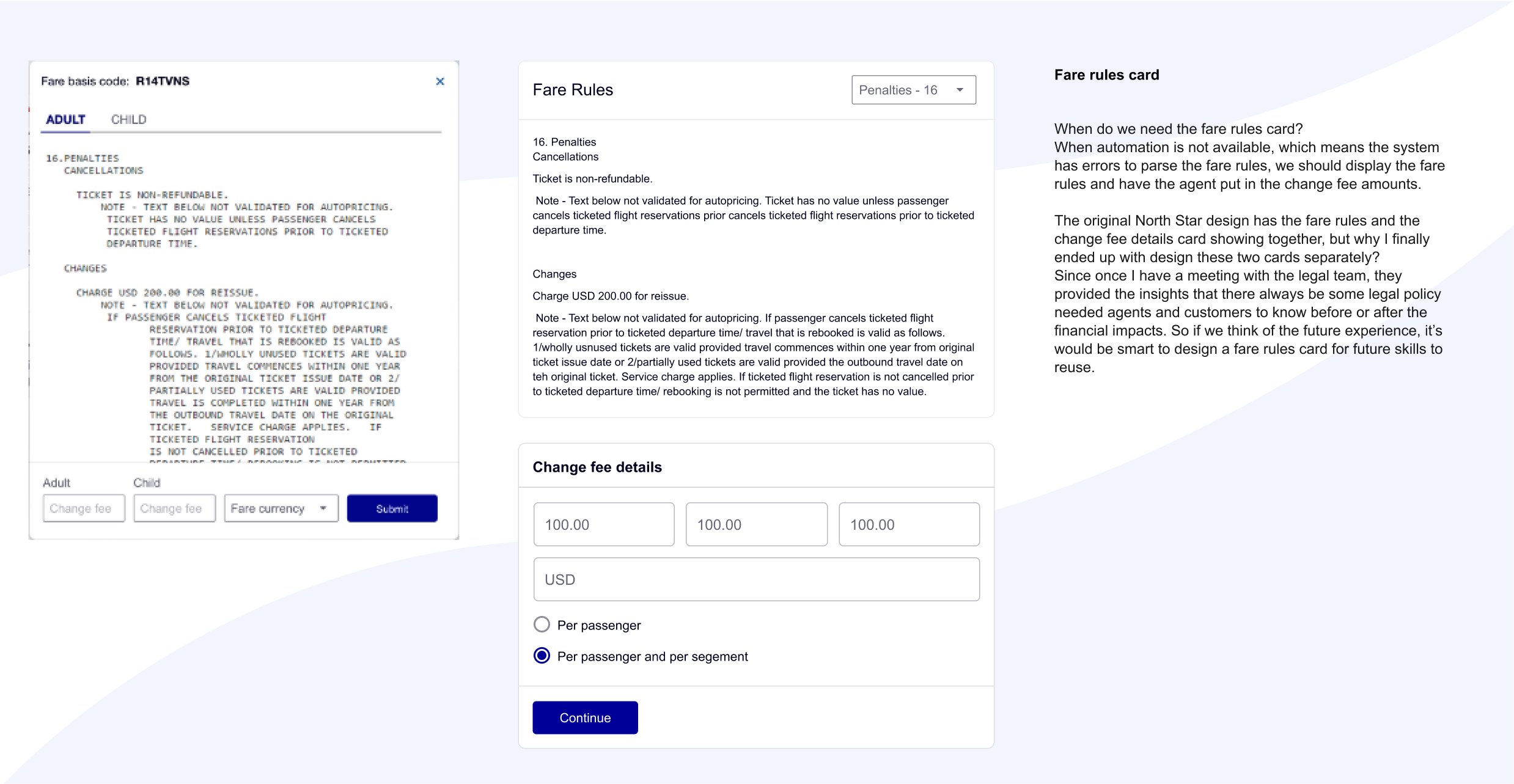
- When automation is not available, display the fare rules and have the agent put in the change fee amounts
- When the ticket is eligible for waivers, display designs for the agent to apply waiver code
- When the system is not working, or the ticket stats is expired, the system should lead the agent to GDS
All these fallbacks should be applied for
- One way
- Roundtrip
- Single-segment (i.e. changing only the return flight in an RT or the departure flight)
- Split tickets (RT flight with two different airlines)
- Multi-destination (2 or more origin/destination pairs)
- Enroute (after one leg has already been flown in an RT)
- Divides (less than all travelers)
Out of Scope
- Involuntary changes
- Name changes
- Worldspan inventory
- Itineraries with infants
- Payment types other than credit card (i.e. coupons, points, etc.)
- Consolidator fares
- LCC, Ticketless, Charter, Basic Economy fares
- Out of Sync
- Changes with waivers
- Changes within the void window
- Not Ticketed
- Flight Starts in next 6 hour
III. Ideate

The Challenge
Challenge 1: How can a conversational experience provide agents an intuitive and contextual experience without breaking the tech back-end logic and agents’ regular flight change process?
To make the project go smoothly, I need to know the tech limitation and the back-end logic as much as I can and think about the fallback and graceful failure scenarios ahead.
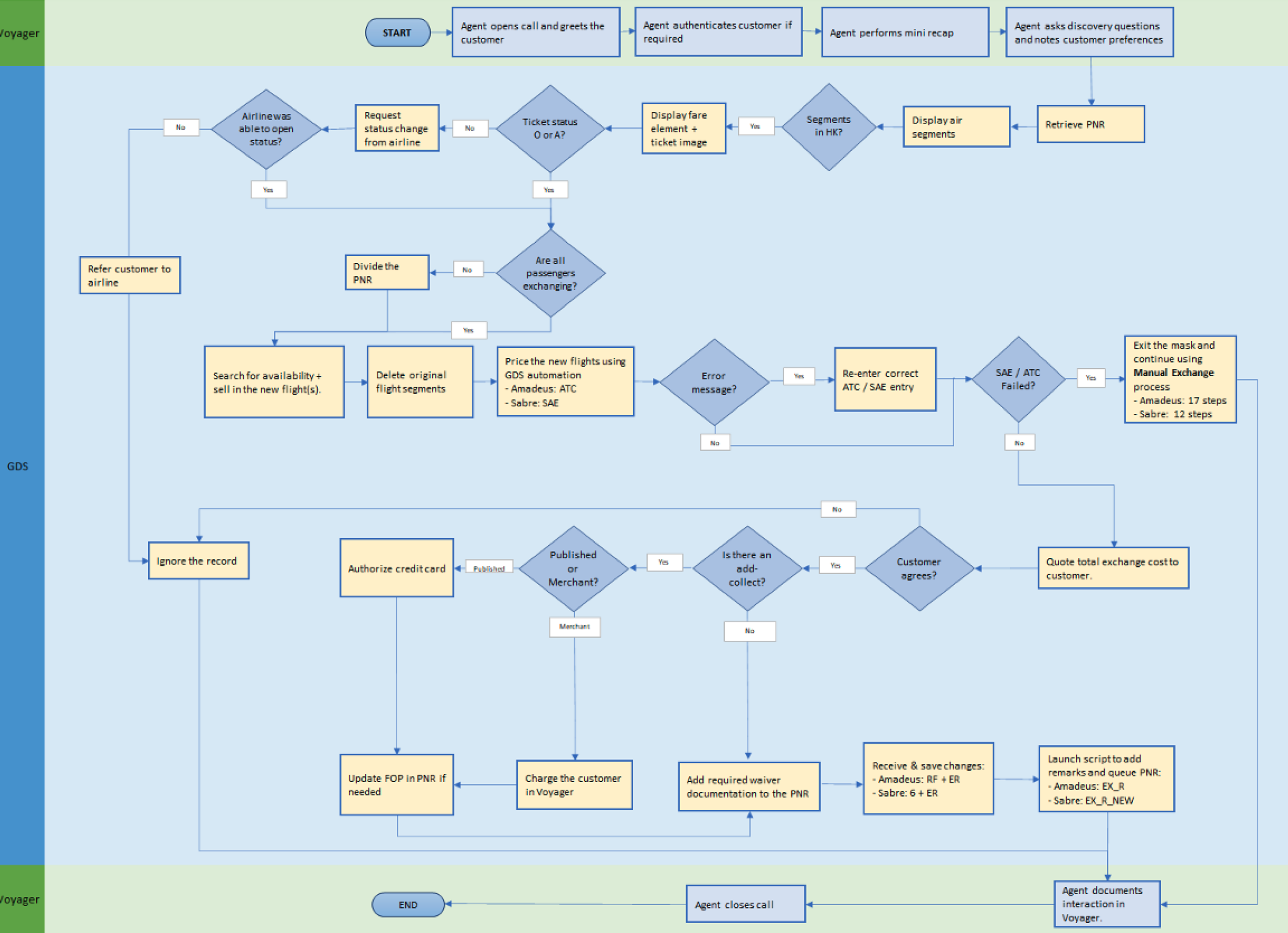
I have learned many scenarios and domain knowledge at the time. Due to the complicity of the cases, I started to think about how the experience would be working in a cohesive system. Then my next biggest action to take is partnering with PM and Service Delivery and Operation teams to work on a high-level system flow to reflect the agent’s flight change process. The working process allows me to have a deeper understanding of the steps of agents to handle the task.
Image: agent’s current flight change process flow
Combining with Dev’s decision tree diagram, I worked with my PM to come up with a high-level flow that reflects both the agent’s process and the logic points.
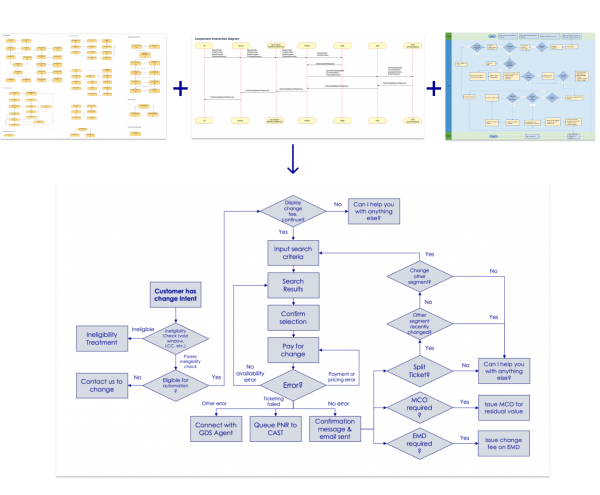
Image: high-level system workflow
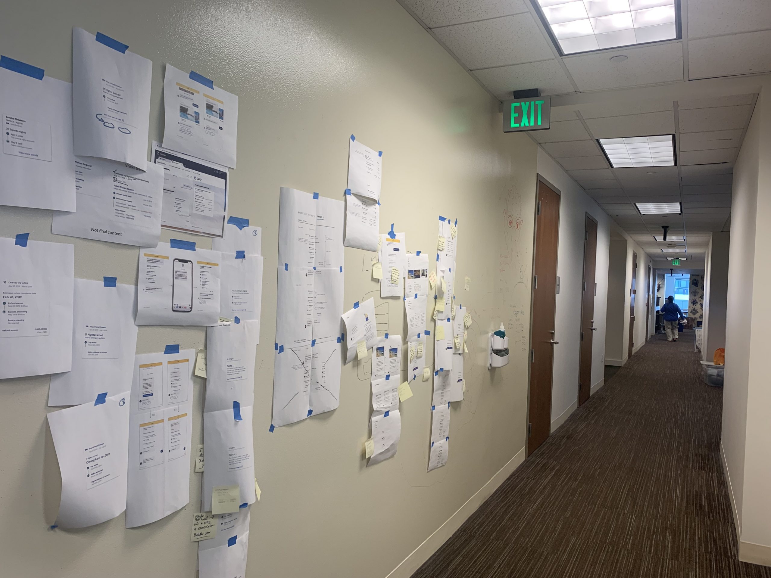
After coming up with the high-level flow that reflects the logic points, we reviewed this with engineers and got feedback about what logic points make sense, what’s not make sense. What logical points we could potentially fetch the data thru API, what data is needed but could be potentially hard to fetch at the moment.
Then based on the feedback, I come up with a high-level UX workflow reflecting the best user experience based on all of these insights and limitation considerations.
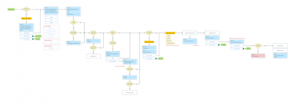
Image: high-level UX workflow
Challenge 2: Define the conversation design pattern and best practice for agent-facing project since it’s a brand new skill in the platform
Always starting with the North Star
Featured steps I have taken in this phase:
- Explorations on complex flight change scenarios within the Virtual Agent in vNext
- Designing with NLU (Natural-language understanding) first approach
- Define when a robust card is needed in the complex cases
- When automation cannot be used, what is the fallback UI
Define the experience:
After finishing all of the user analysis from the user research, I started to define the ideal experience for agents that could be potentially utilized in the future. I asked myself:
What should be an ideal experience for the agent?

Keywords in my mind:
Intuitive
Proactive
Intelligent
Contextual
Customizable
Flexible
Imagine the possibilities:
Then based on the insights from user research, I started to explore the ideal-to-have features we could include in the virtual agent experience for the agent:
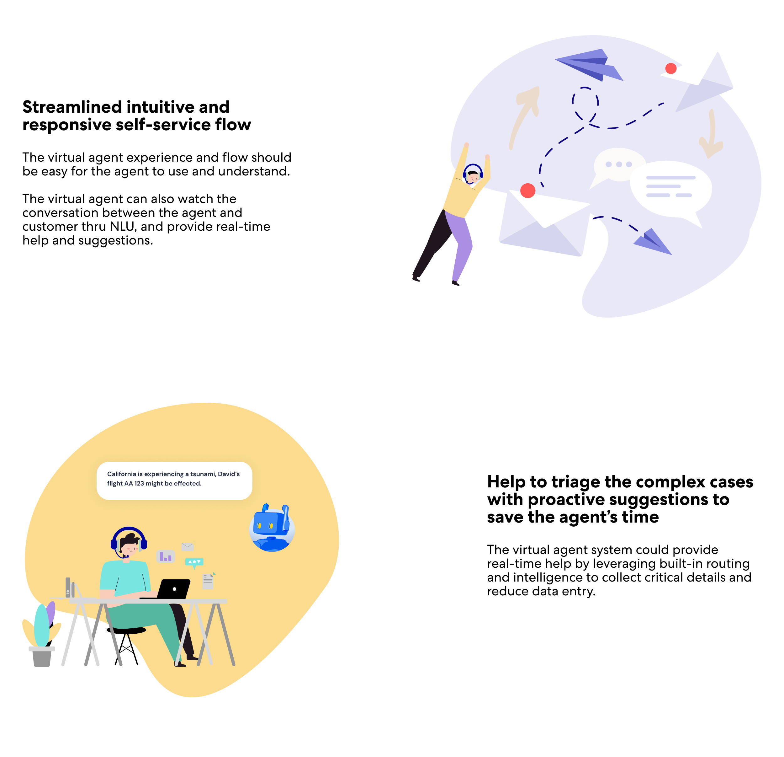
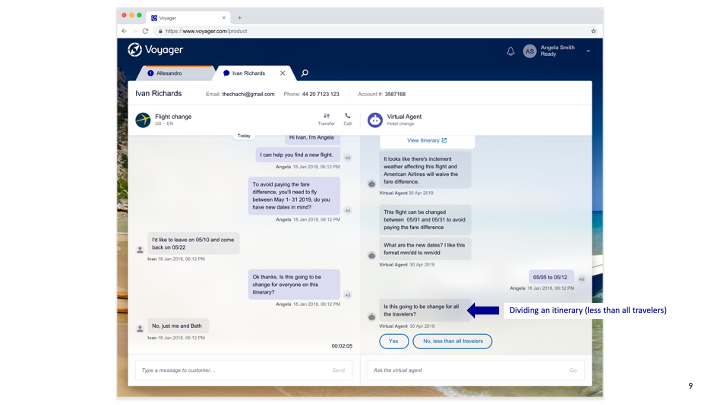
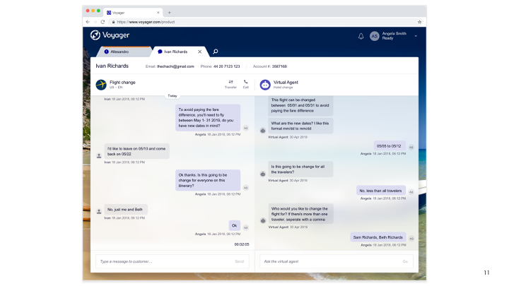
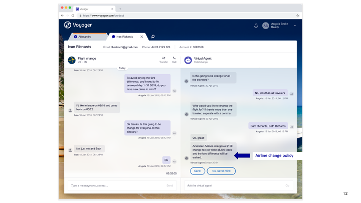
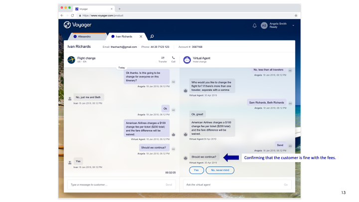
Here to show 3 scenarios:
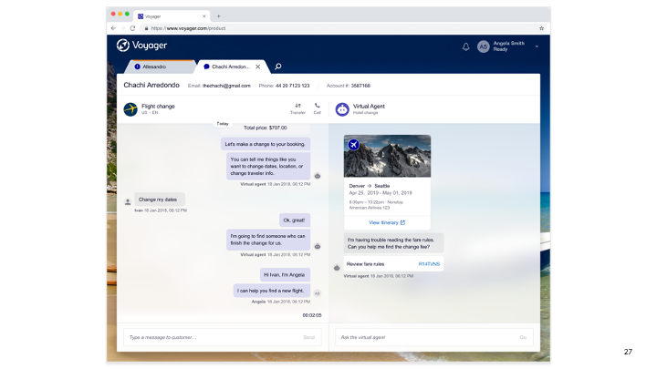
Scenario 1: Flight Change with a less than all travelers and automated waiver
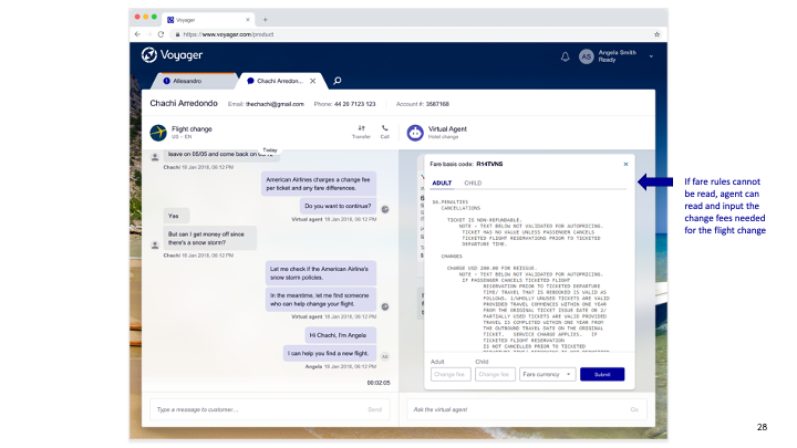
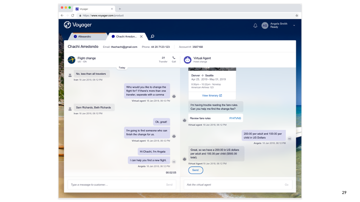
Scenario 2: Flight Change with unparsed fare rules
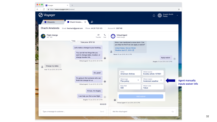
Scenario 3: Flight Change – Virtual Agent needs waiver info
The Robust Card Design
– Working with a content strategist & engineers along the way
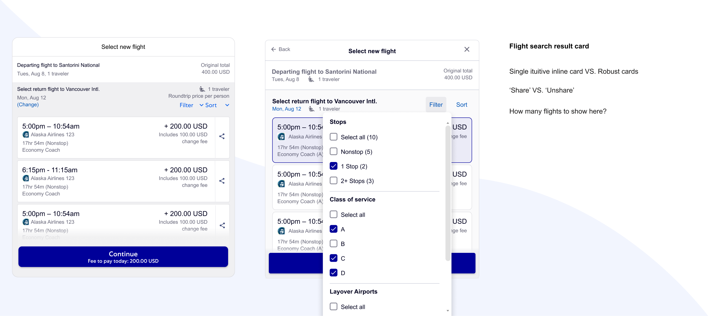
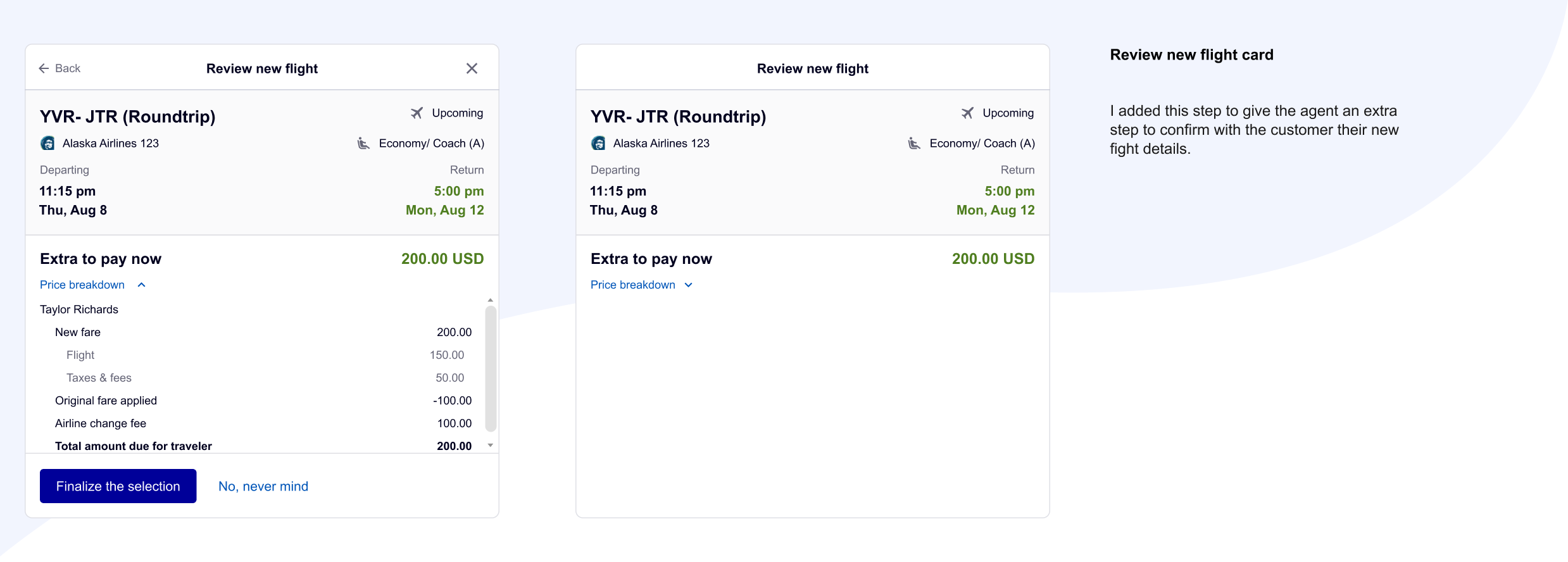
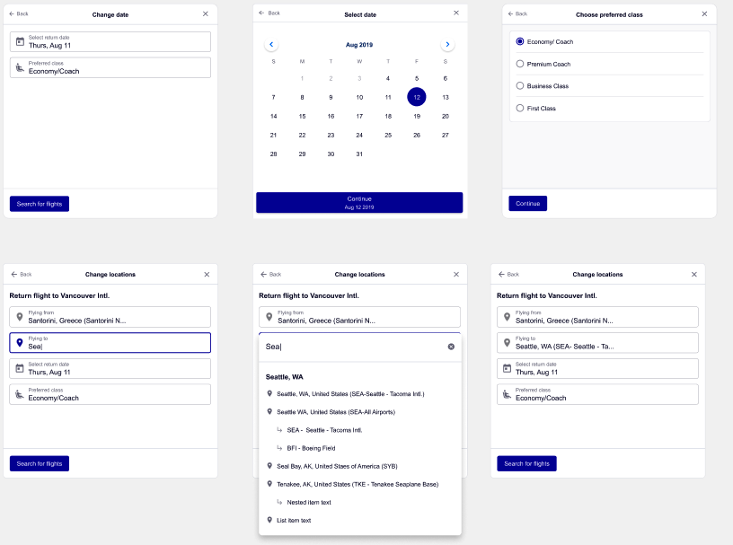
After ensuring the experience makes sense and defining where to use the robust cards, I then started the robust card design. The goal is to use these inline cards to allow the agent to change the flights. Due to the NLU limitation, we have to use robust cards for:
- Booking selection
- Time/ Date/ Location selection
- Flight search
- Search results
- Review new flight
- Payment
- Updated new flight card
- Fare rules
- Waiver card
- PNR
The stories behind the cards
At the same time, me and my content strategist worked together to apply the best practice for both design and content, meanwhile delivering a detailed UX conversation workflow to identify the ideal user experience. Since this is the first agent project, the flow has gone to rounds of design reviews with senior leadership, and I also got the chance to work with content leadership to define the guidance, and voice & tone too.
The conversation workflow
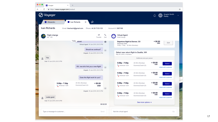
The flight change for agents follows this very simple and basic pattern:
- Select the flights and travelers you want to change
- Input the new criteria (dates, times, origins, destinations)
- Select the flight that best suits the customer’ needs
- Pay for the flight in the customer’s preferred form of payment, if payment is necessary
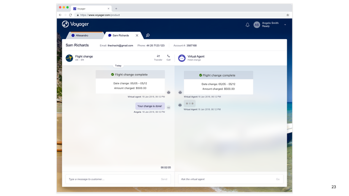
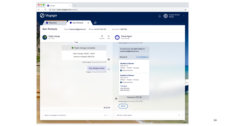
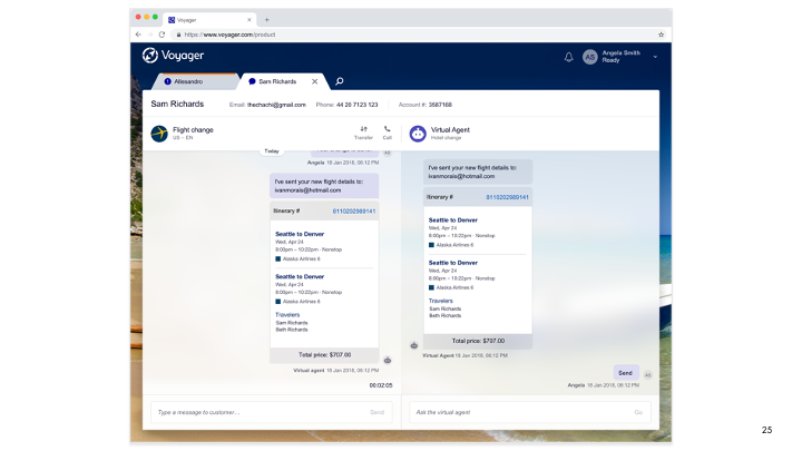
- Receive a confirmation that the flight has successfully been changed and the new itinerary
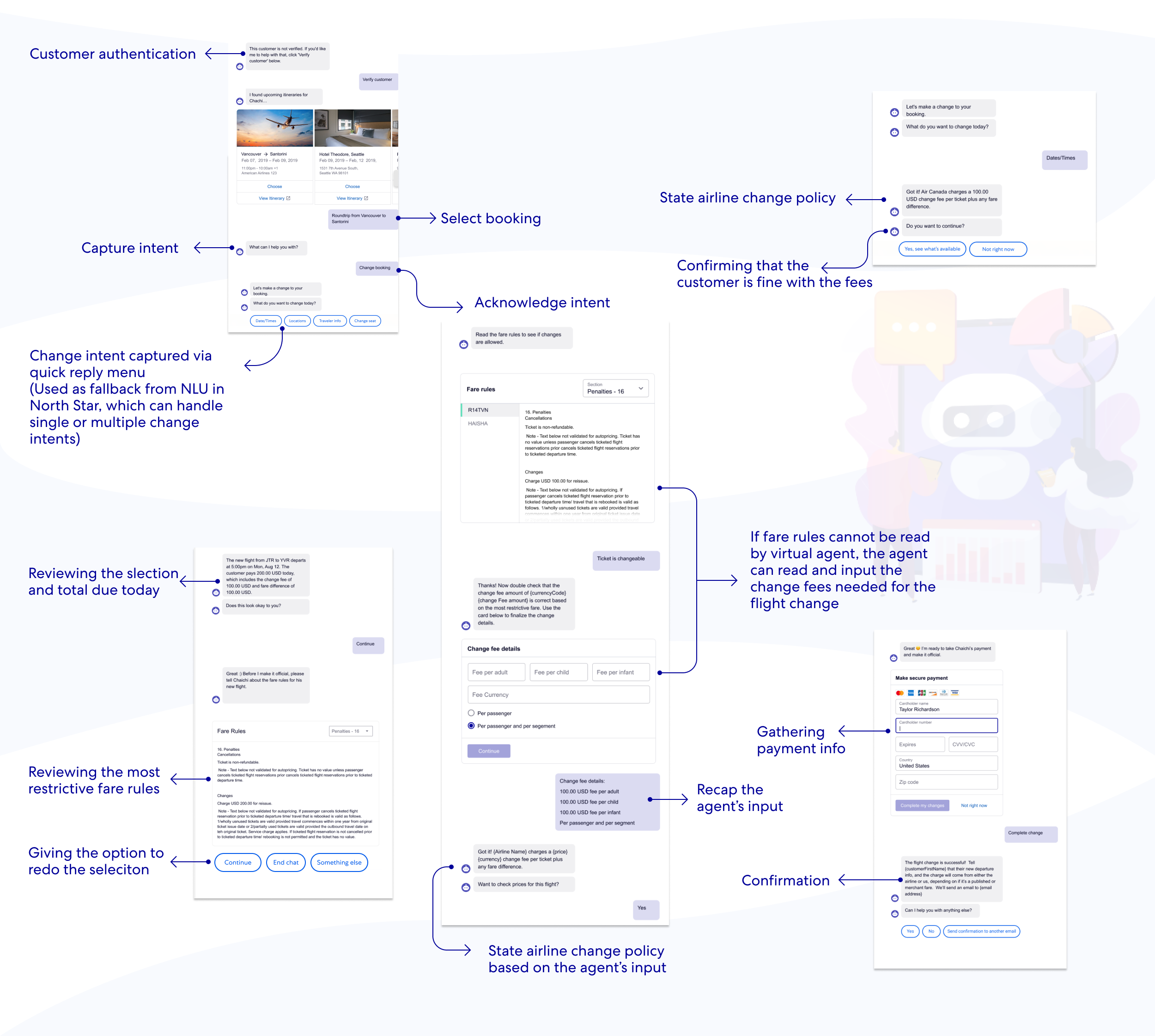
North Star – Designing with NLU first approach
Always put aside the limitations and imagine the best North Star experience. The North Star design idea is to capture and parse the customer’s needs, intents, insights, flight info, airline change policies, and fare rules intelligently with the help of artificial intelligence, and natural language understanding.
Let’s first take a look at what the original workflow looks like.
Define the Phase 1 workflow – what we could deliver based on the tech limitations
After showing the North Star workflow design with engineers, we learned the NLU technology is not strong enough to allow the virtual agent to watch and learn the customer inputs, but I believe eventually we will get there! The next step is to design a workflow that we could launch for phase 1. The Phase 1 workflow has also gone through rounds of design reviews with senior leadership, stakeholders, and engineers.
Let’s first take a look at what the Phase 1 workflow looks like.
Phase 1 partially automated workflow
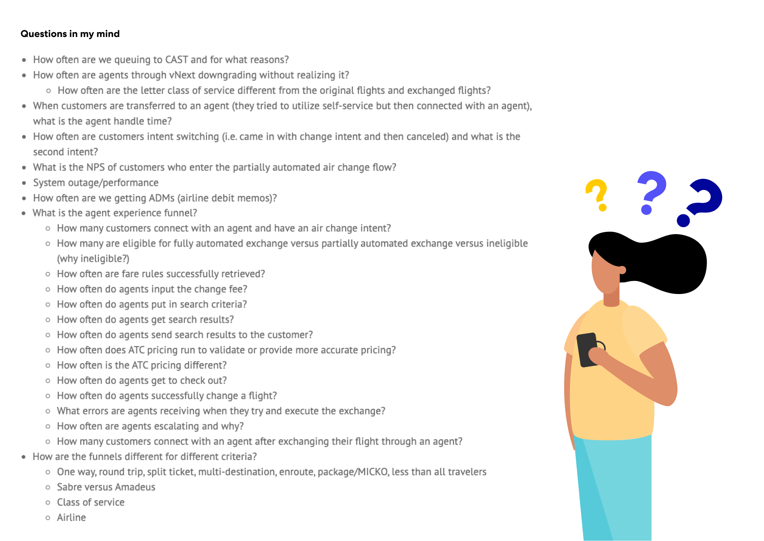
Before starting the partially automated workflow design, I have so many questions that needed to be answered.
Scenario 1: unparsed fare rules
When automation is not available (system errors, fare rules cannot be parsed, etc), what will be the agent experience?
Based on the exploration, the ideal experience is to display the fare rules for agents and have the agent put in the change fee amounts. In this way, the agent won’t need to either checking generic fare rules in the knowledge base, calling airline companies, or leaving and redoing the task in GDS. It could help the agent to save time and simplify the process.
Scenario 2: Ticket stats is expired
When the system is not working, or the ticket stats is expired, the system should lead the agent to GDS. This is a must-have graceful failure case, and this is what all the global agents need to do at the present stage.
However, what could we do to enhance the GDS hands-off experience?
Two things I pushed here are:
- Checking with the flight experts how does the agent determine which GDS to use under what circumstances? If we could define the scenarios, we could then show the agent which GDS to use in the graceful failure message.
- Can we directly hand off the case of the expired ticket to the T3 agents?
Reasons based on the user research findings:
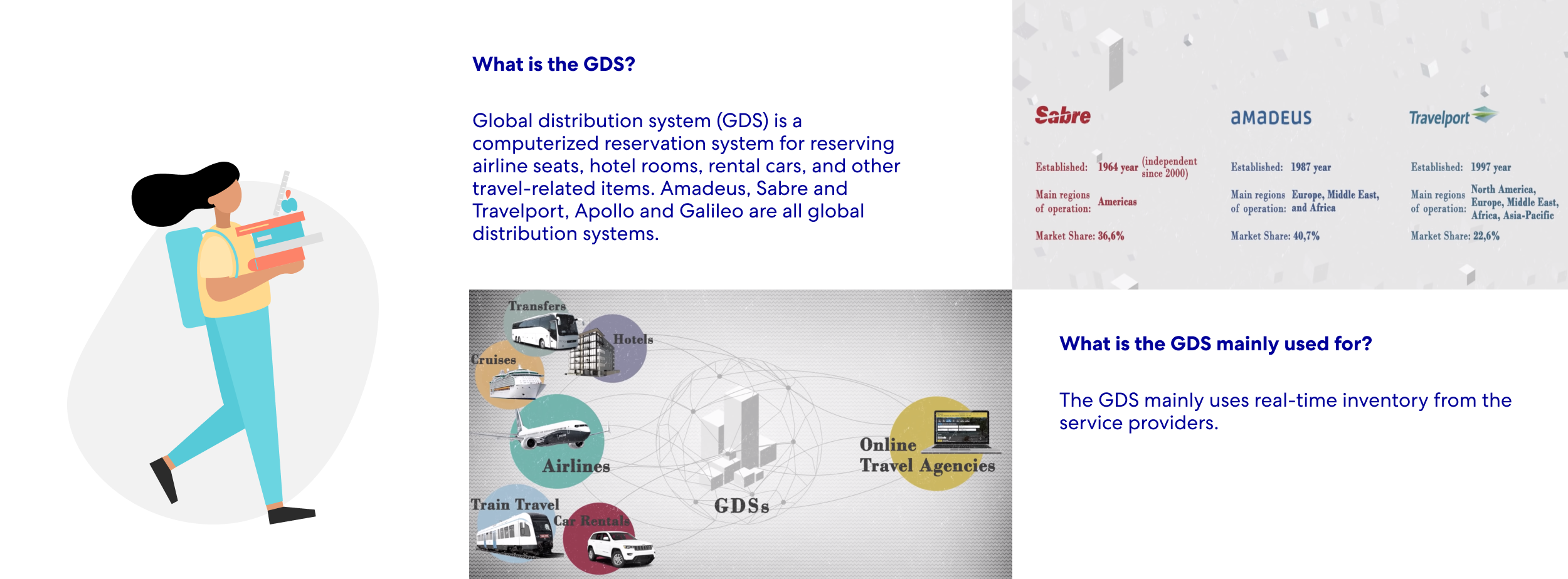
From the early user research, I learned there is not only one GDS out there. Global distribution system (GDS) is a computerized reservation system for reserving airline seats, hotel rooms, rental cars, and other travel-related items. Amadeus, Sabre and Travelport, Apollo and Galileo are all global distribution systems. In the phase we refined the scopes, my pm and Service Delivery team defined we only considering Sabre, Amadeus, and NDC inside the scope for Phase 1 delivery.
Another finding from the user research, when I conducted the interview with agents, one of the agents mentioned that only T3 agents could read the GDS command line since T1 and T2 agents have different agent training which doesn’t include how to use GDS.
Scenario 3: Waivers
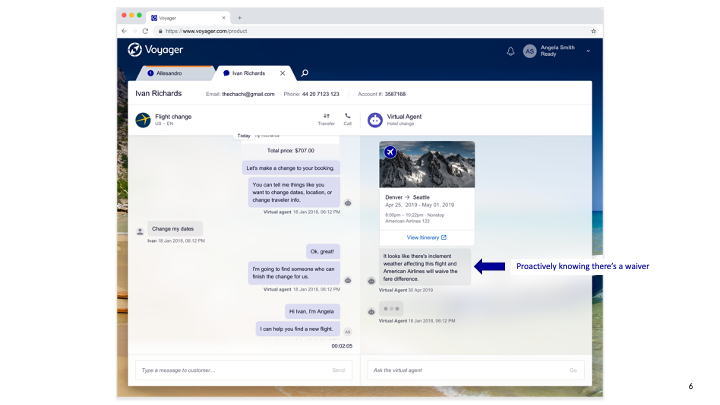
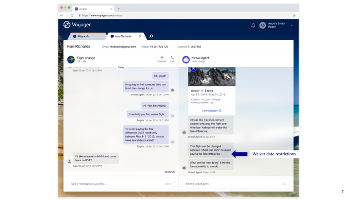
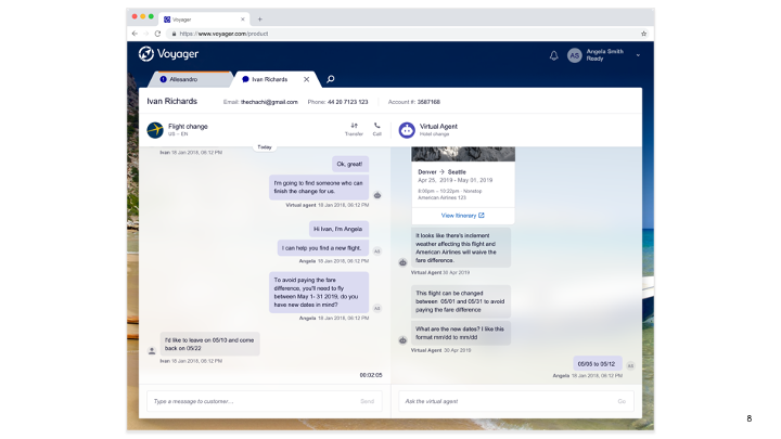
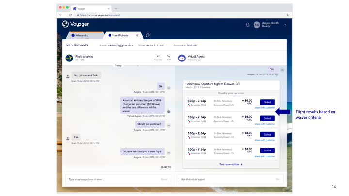
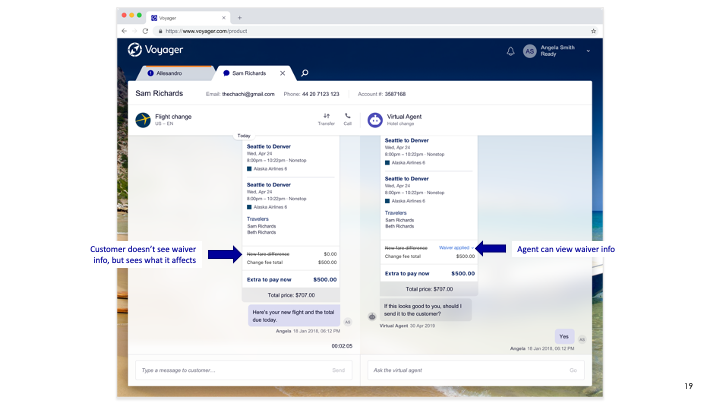
When natural disasters occur, each airline will come up with related policies, which we called Flex Policy. When the ticket is eligible for waivers, and the Flex Policy applies, in the ideal process, the virtual agent could proactively know there is a waiver and could intelligently show the date restrictions before capturing any further change intent. However, when the system is not working, a fallback option could be displaying the designs for the agent to apply a waiver code. Then agents won’t need to go to the knowledge base or airline website to find the waiver code.
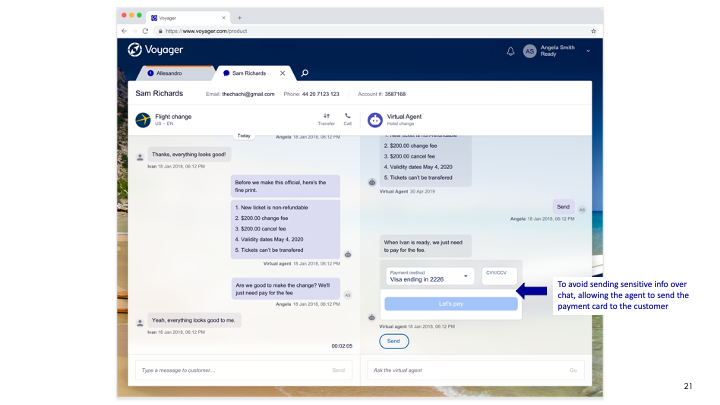
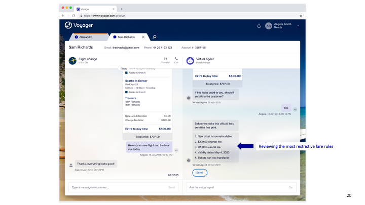
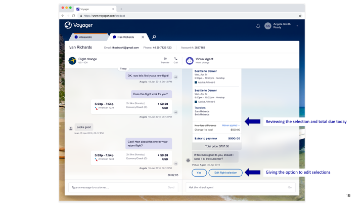
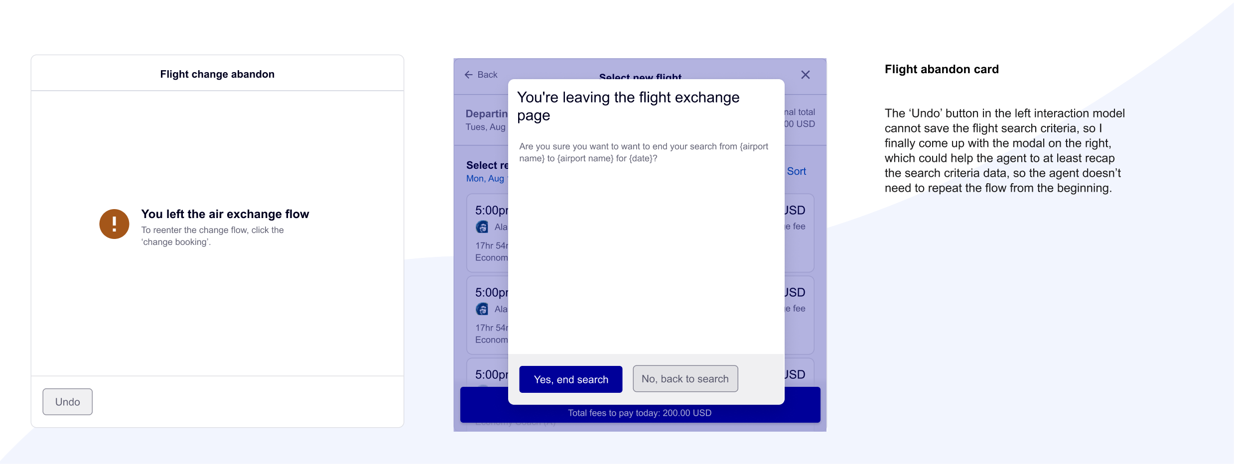
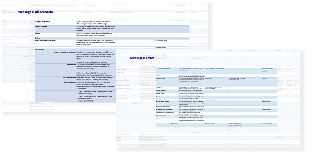
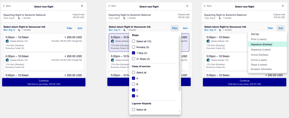
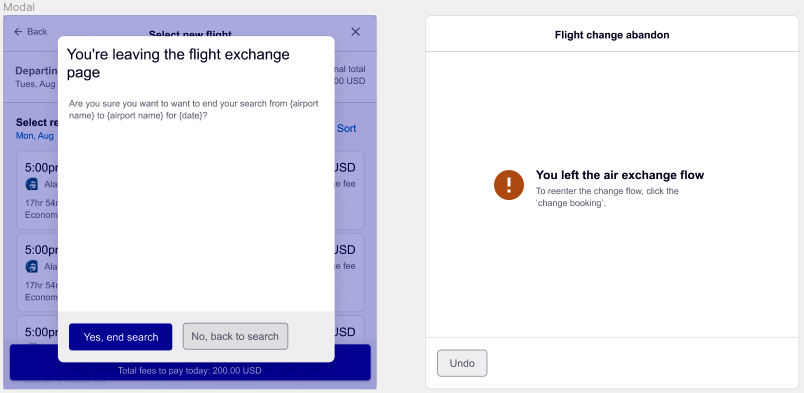
For this complex project, we have to work on many use cases, think about the messages based on the airline policies, the system fall-back, graceful failures, agents’ behaviors, and legal comments. Due to the NDA, I cannot show too many details here. But, have a quick glance at the final messages and feature designs.
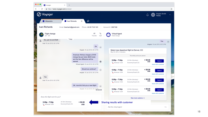
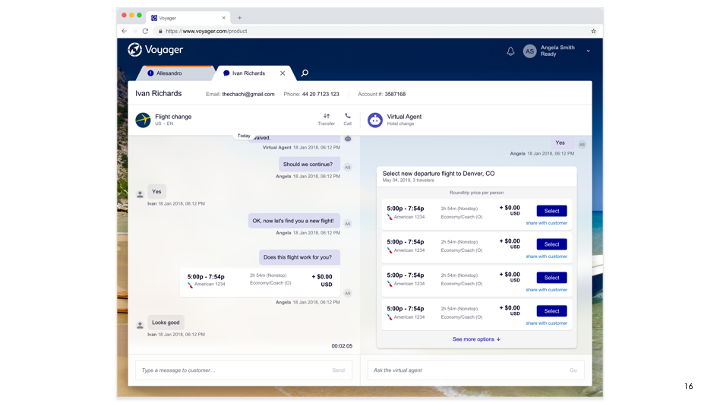
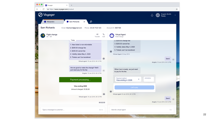
The conversation design showcase
Thoughts to share
Why focus on being systematic and platform-minded when doing the conversation design?
- We’re creating cohesive design solutions that aid users in comprehension, trust, and adoption as customers return, again and again.
- Unique “snowflake” solutions are harder to maintain internally. Uniformity is more scalable.
- Systems thinking allows us to work smarter, so we don’t have to duplicate work and ask the same questions others already have.
- Valuable for the ‘Localization’.
Craft reusable, flexible user flows and design components that satisfy complex business and technical requirements, without sacrificing the usability, personality, and soul of the experience.
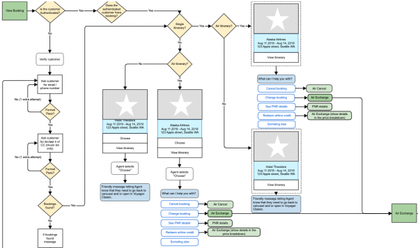
Examples for reusable workflow:
- Entry Point
- Global Skill – Authentication
- Upcoming Booking
- Flow Connection & Agent Hands-off
IV. User Testing – Call Center Visit
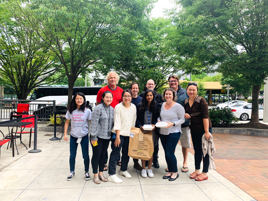
Before launching the product, in early Nov 2019, I went to Springfield, MI call center for user testing. I tested both the North Star and Phase 1 flow with 13 agents.
- 11 BEX Test and Learn Group agents for 2 Focus Groups (voice agents)
- 2 BEX Test and Learn Group agents for 1:1 interview (voice agents)
What I tried to test:
Flight Change flow in vNext
- Understanding the pain points of agents to use VA for Air skills
- Gaining feedback and insights to figure out if the Flight Change flow makes sense or not
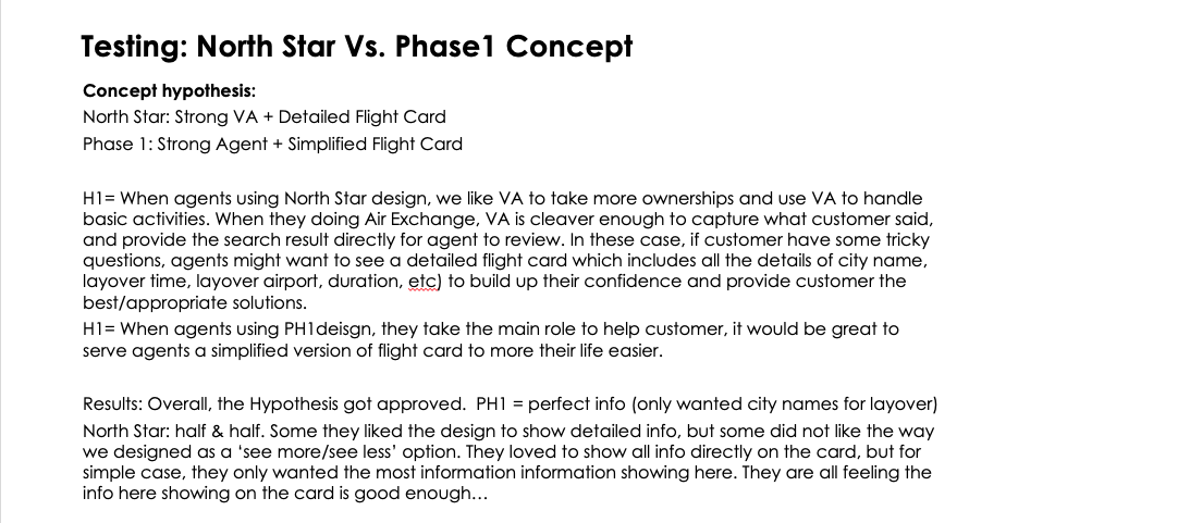
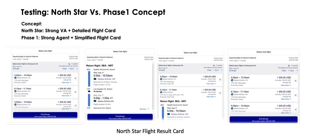
- Testing whether the information showing on the flight snippet card is enough or not
- Gaining insights/ feedback for content, voice, and tone
- Gaining insight on what features in the Voyager Classic are missing here in the vNext design, what are the features agents expected to have but not showing in the vNext
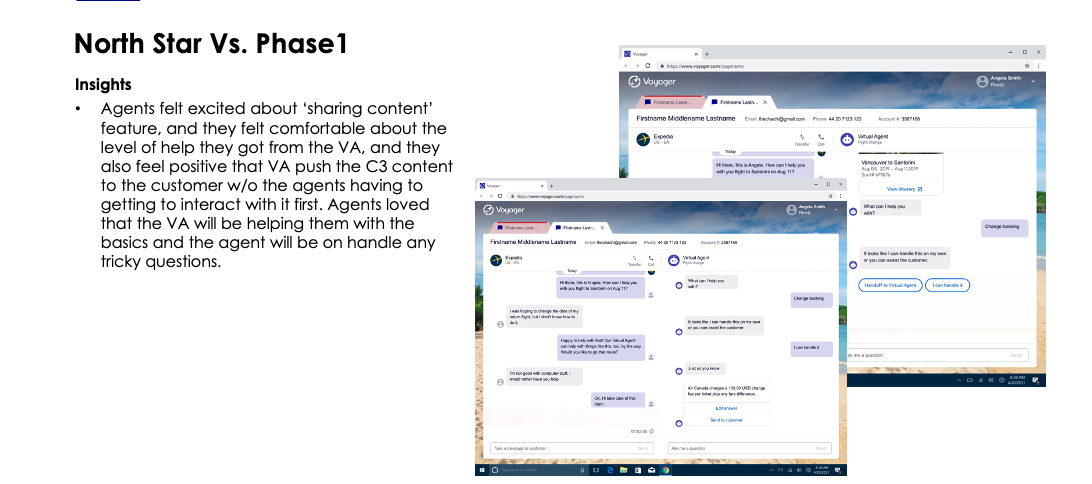
- Learning about agents’ acceptance of the level of help that they get from the VA (North Star VS. Phase 1)
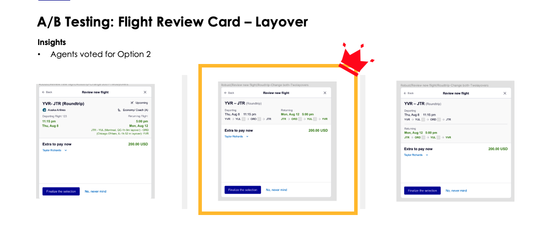
- A/B testing for flight review cards of multi-destination & flight snippets
Activities I did during the testing:
- Focus group
- Side by side agent observation
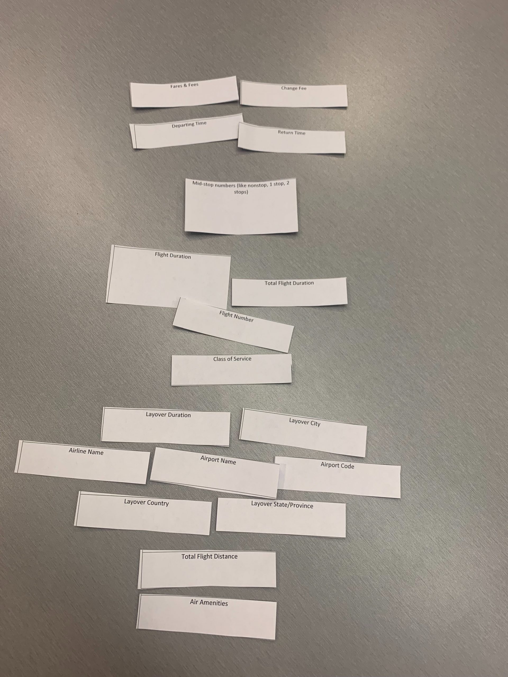
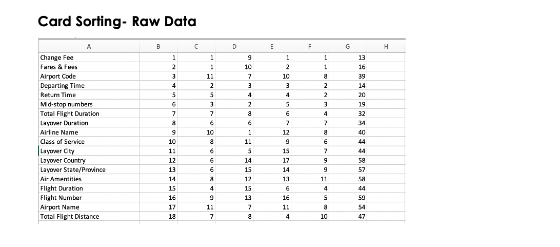
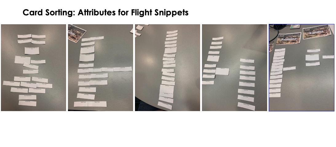
- Card Sorting
- Interview
The Findings: High-level takeaways
- The overall process was perceived as easy and friendly
- All participants were able to complete the process easily with minimum guidance or confusion
- Most of the participants were able to interact with the UI patterns without confusion
- PNR Details are not easy to understand, would be great to only show that for T2 and T3 agent. (T1 agents do not necessary read the PNR details and they were not got trained for GDS
- Agents loved the new design could stick to some features in Voyager Classic & Voyager Flights. (Note taken session was missing from Voyager Classic, and agents were eager for having this feature.)
- Agents wanted ‘city’ instead of airport code
- All the chat participants (13/13) loved the North Star idea of sharing content (policies, flight details, confirmation messages, etc.) and felt comfortable about the level of help from VA
V. Execute
The launch
Fully launched
The product launched at the end of 2019, and after that, we then did a fast-follow based on the user testing findings in Jan 2020. (eg. adding airport codes to the carousel, etc. )
Fast-follow based on the user testing feedbacks
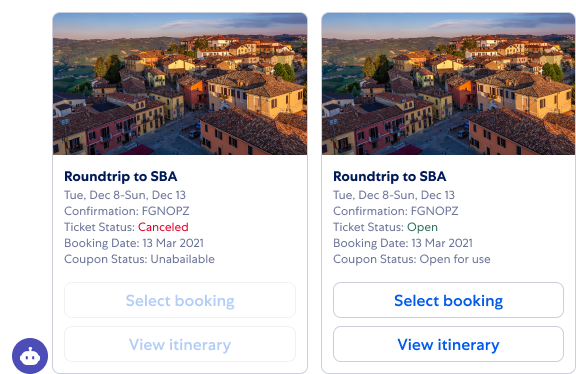
From the usability testing, I learned the agent needs more information to define the status of a booking. Based on the user feedbacks, I quickly came up with a new carousel card design to add some must-have information there and talked with Devs to grey out the CTA buttons when a ticket status is canceled, which could mean the ticket is not changeable at this moment.
Creating training materials for agents
After the product launched, I later partnered with an instructional designer to deliver training materials for call center agent training. Here are some of them, click to play the videos if you find them interesting!
05 What I’ve learned
The reflections on the future work
See the world through your user’s eyes
You must put yourself in the shoes of your user, or in the case of the Met challenge, the visitor. It will require you to make assumptions that may or may not be true, but that’s okay. Once you understand what is important to your user, you can better design your product to fit their needs.
Everyone has a story
Everyone you meet has a story that will give you insight into their character. When conducting interviews with users, look for that story. Ask questions that will elicit deeper responses. Finding that story will increase your empathy for the user and reveal their needs.
There is no perfect design, only the better design
Be open to the failure and feedback, and think of how to make it better.
Cherish all the friendships and relationships
As designers, we have the mission to make this world a better place. Instead of work, one thing that we can do is to build relationships because as time goes by, everyone will realize that work is all about relationships.

